“The great strength of a presentation is the personal relationship between speaker and audience,” says the official TED Talks guide to public speaking. And good slides strengthen this bond by enriching the speaker’s speech.
The human mind is a system: it works in an integrated way, combining different types of information. So, like the content, the aesthetic appeal of your slides is part of the message you want to convey to viewers.
Through them, you can show what is difficult to describe in words. Or you can show and describe in words, offering the audience new perspectives on what is being presented. Explore, innovate, take advantage of this resource in the best way possible.
Do you know what differentiates a bland, forgettable presentation from a memorable one? How are your slides? Critically analyze this: do they fit into the first or second category? If it’s the first case, do you want to know how to improve them?
Here is the right place for it. In this post, we’re going to teach you some simple but fundamental tips to make your slides look amazing and capture your audience’s attention once and for all. Check it out!
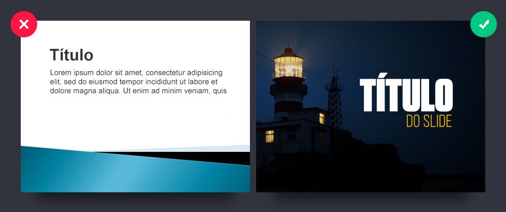
#1 – Do not use the themes offered by your presentation editing software.
.

Using your software’s slide themes (Powerpoint or Keynote) is like declaring the death of your presentation. They are, for the most part, of poor visual quality and end up limiting the creation of the slide instead of adding value.
It’s critical to create cleaner presentations so your audience better understands the idea or story you intend to defend or tell. Remember: your presentation must be visually consistent with the theme it presents!
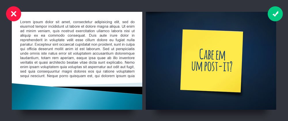
#2 – Use less text!

Whenever you develop a script for your presentation, put yourself in the shoes of your audience. What do you expect when you attend a lecture or sales report presentation, for example? Surely the slides are not boring and full of textual content, correct?
The idea is to always let the presenter talk about the slide. This shows the audience that he dominates the content, as well as providing more security and credibility. In your presentation, as you speak, the audience will pay attention to you, not the slides. Use them to complement your ideas or to get the audience involved in what you intend to say.
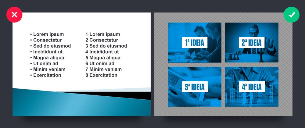
#3 – Avoid bullet points/markers

A valuable tip: try to use only one idea per slide. Your audience won’t remember ten or more topics or number bullets on a single slide.
The solution is to split each idea into a different slide. Consider each slide as a call to action for what you are saying. That way, you get your message across more clearly, and your audience remembers it more easily.
#4 – Don’t abuse the number of images

Images help (and a lot!) in building a presentation that is easier to remember. Making the slide more visual “sells” your idea better, captivates and excites your audience.
But don’t get carried away with the number of images per slide, of course. Don’t make each of them a photo album! Look for an image that represents the idea or concept of that slide.
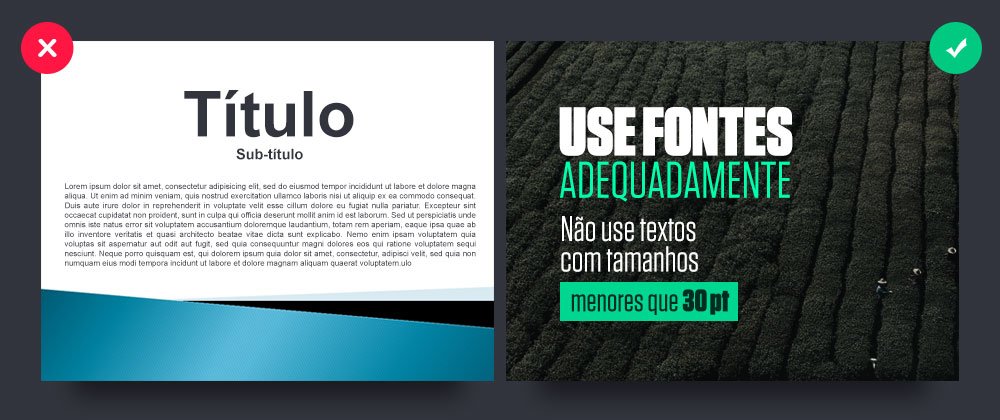
#5 – Use font sizes properly

You are probably developing your presentation on a notebook, right? So be careful: the size of this screen is very different from the screen size of a projector.
When sizing your fonts, don’t just think about the viewers in the front row. The text must be large enough to be read by people at the back of the room. Ideally, you should test your presentation before showing it to the public. If this is not possible, we suggest texts always larger than 30pt or 35pt, depending on the font.


